Bicis de los Altos (BDLA)
1. Concept and Visual Identity
The new visual identity of Bicis de los Altos seeks to project a balance between a passion for high-performance cycling and a modern, professional aesthetic. The design departs from the conventional to offer a brand with character, speed, and a solid structure.
The new visual identity of Bicis de los Altos seeks to project a balance between a passion for high-performance cycling and a modern, professional aesthetic. The design departs from the conventional to offer a brand with character, speed, and a solid structure.
2. Isotype: The Synthesis of Movement
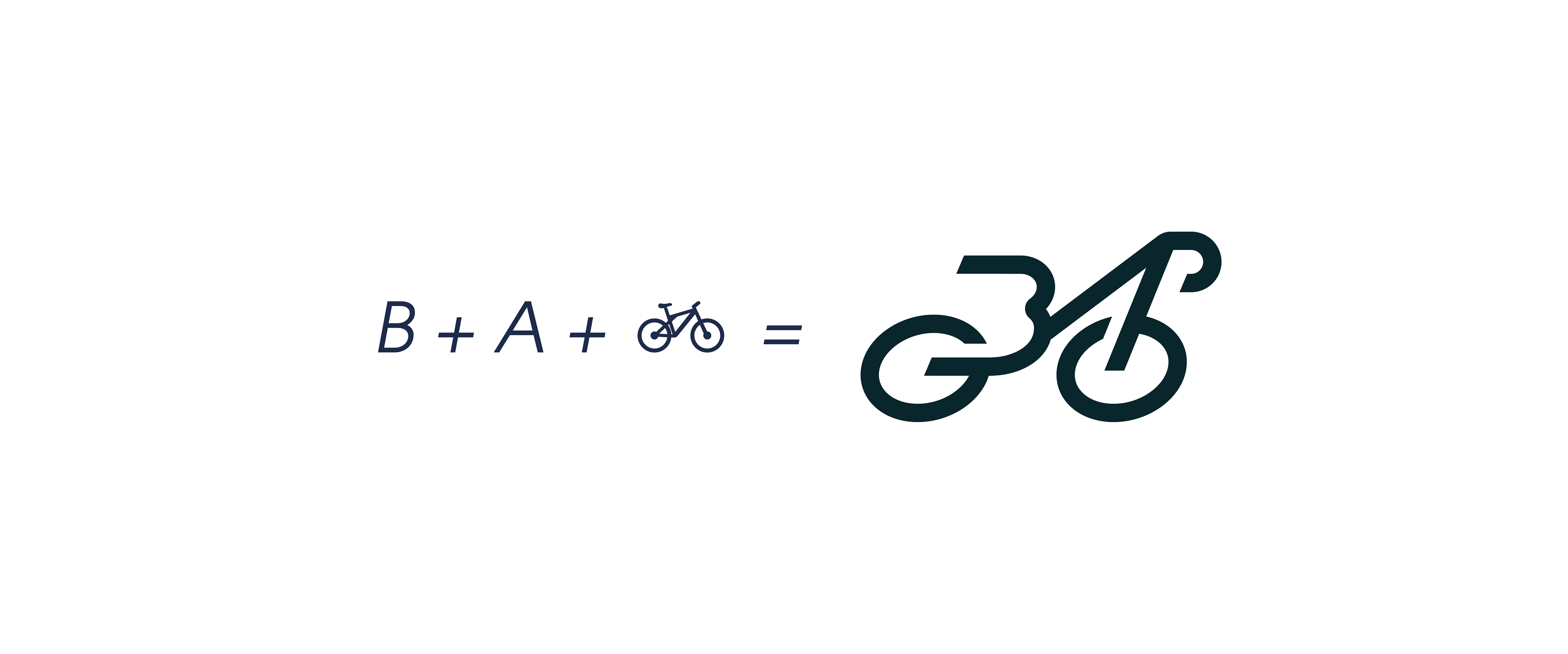
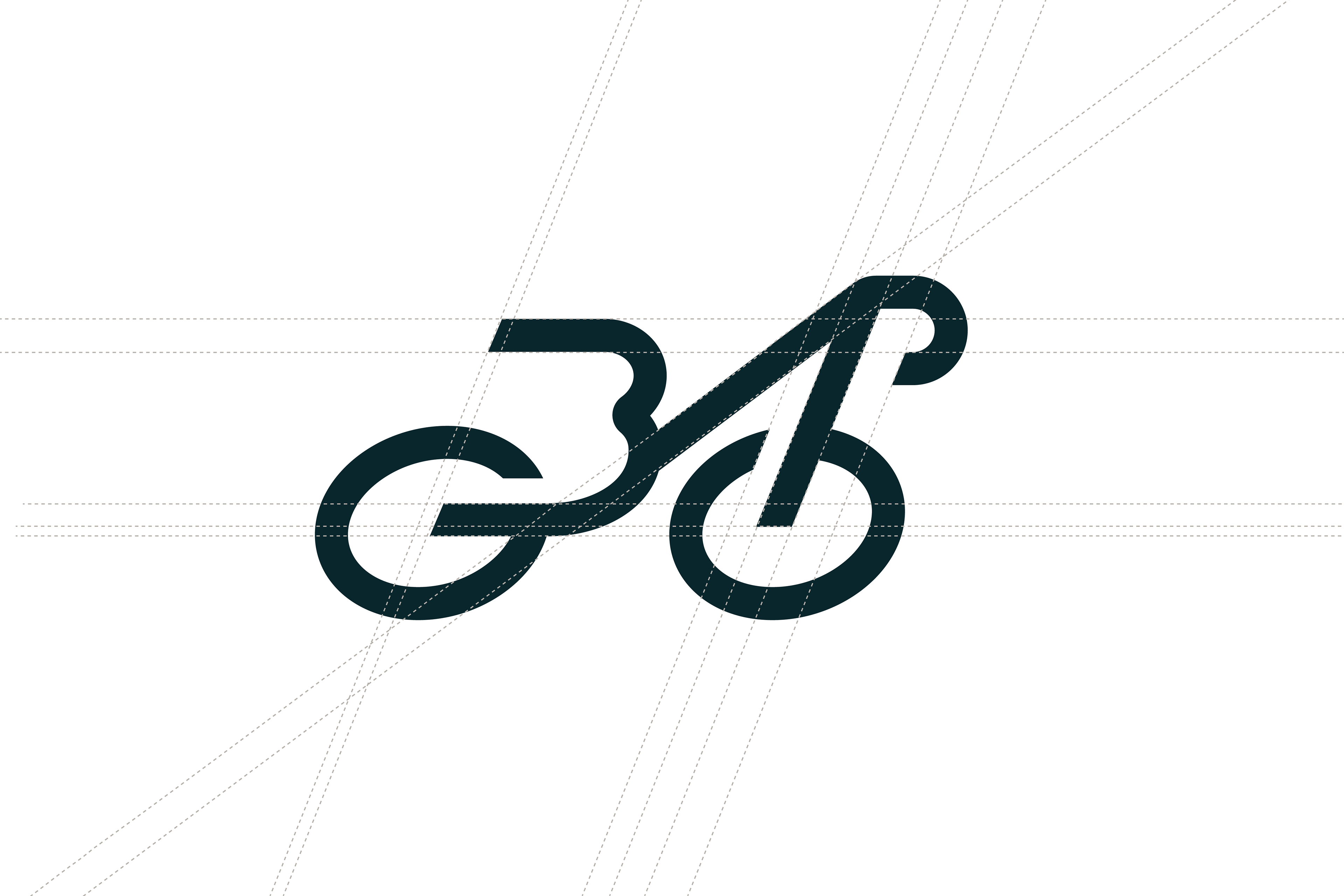
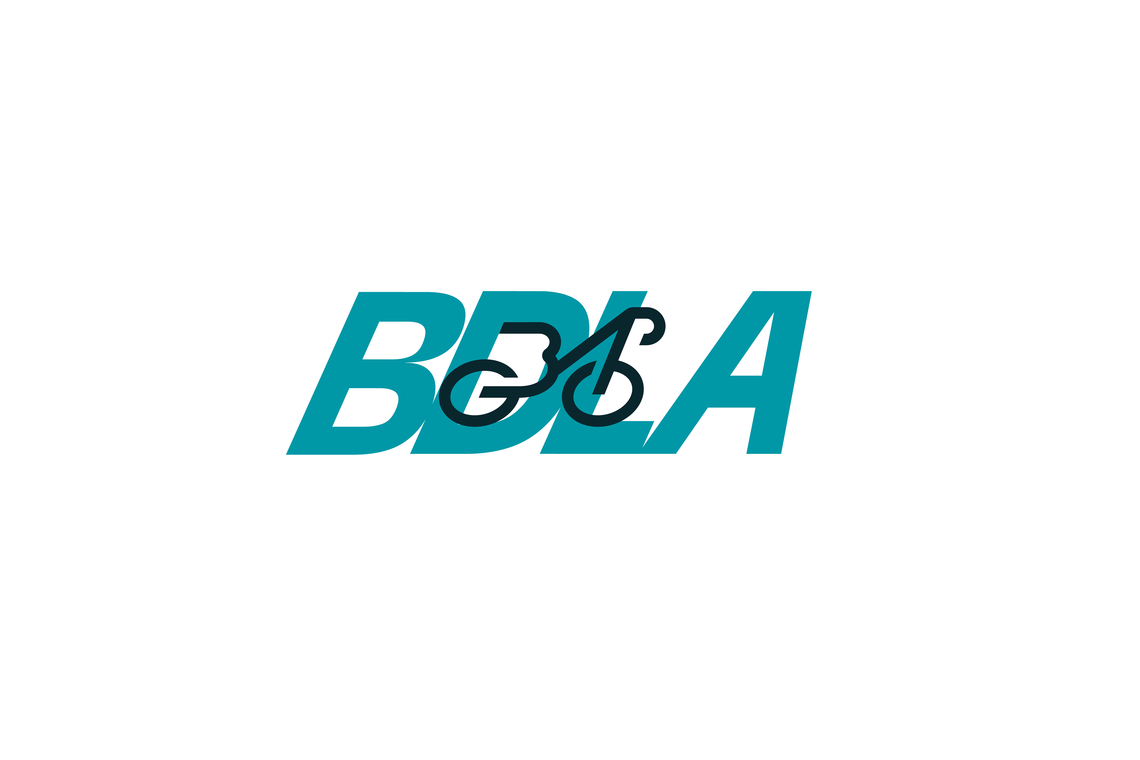
The central element of the logo is a stylized road bike that functions as a clever monogram.
The central element of the logo is a stylized road bike that functions as a clever monogram.
Organic Integration: The bicycle frame abstractly merges the letters "B" (Bicis) and "A" (Altos), creating a symbiosis between the brand name and its main activity.
Directionality: The fluid lines and the icon's posture suggest constant forward motion and aerodynamics, key elements in the world of cycling.
3. Typography and Dynamism
A sans-serif typeface with a right slant (italic) has been selected. This choice is not accidental:
A sans-serif typeface with a right slant (italic) has been selected. This choice is not accidental:
Speed: The slant reinforces the feeling of movement and acceleration.
Legibility: The visual weight of the letters ensures that the brand is legible in both large applications (facades) and critical applications (embroidery on uniforms or small bicycle parts).
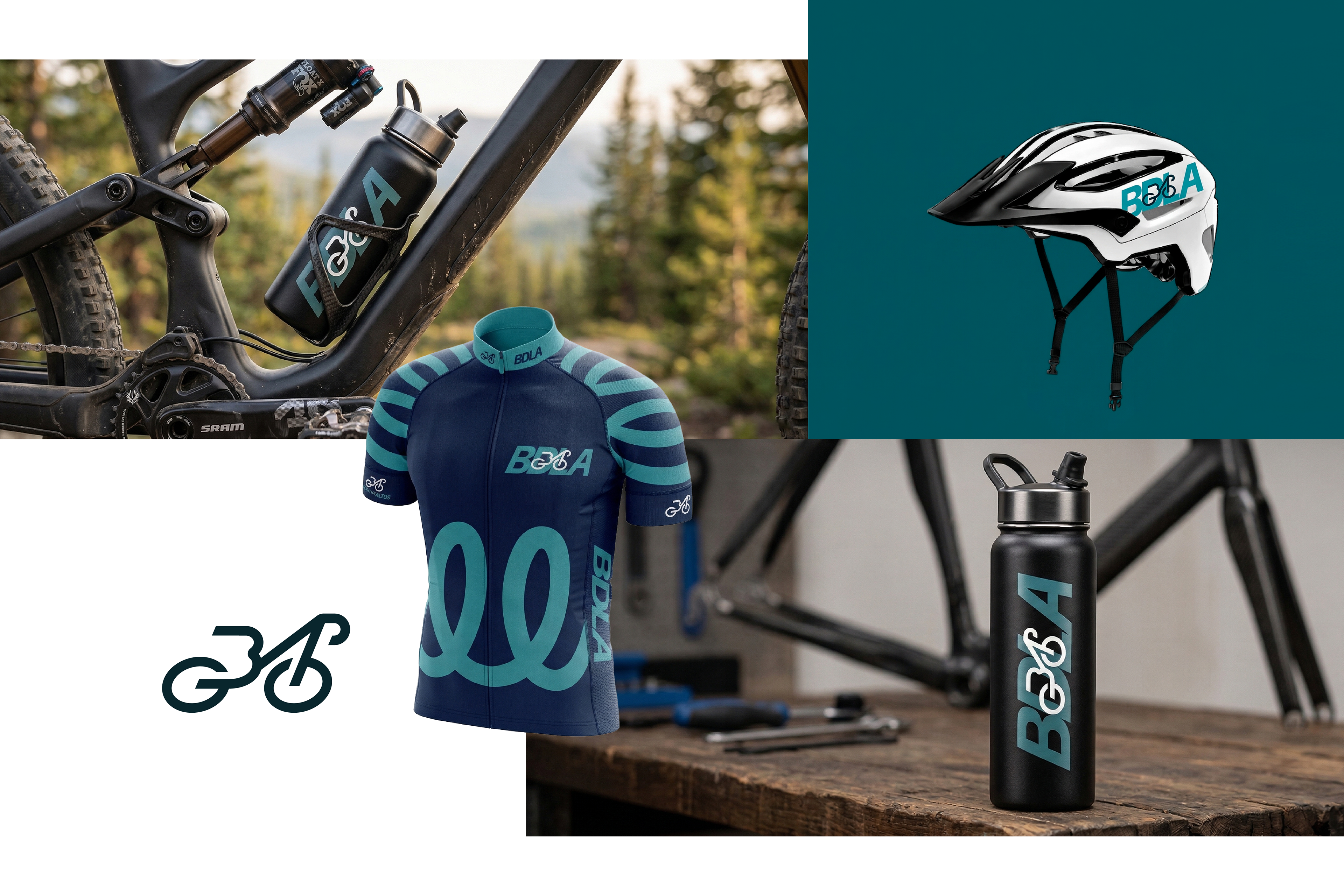
4. Color Palette: "Petrol & Slate"
The color combination was selected to differentiate the brand in a market saturated with reds and blacks:
The color combination was selected to differentiate the brand in a market saturated with reds and blacks:
Petrol Blue / Teal: Conveys technology, freshness, and confidence. It is a color that evokes modernity and a premium approach.
Charcoal Gray / Black: Provides the institutional weight, elegance, and seriousness necessary for a brand that seeks to position itself as a leader in its region.
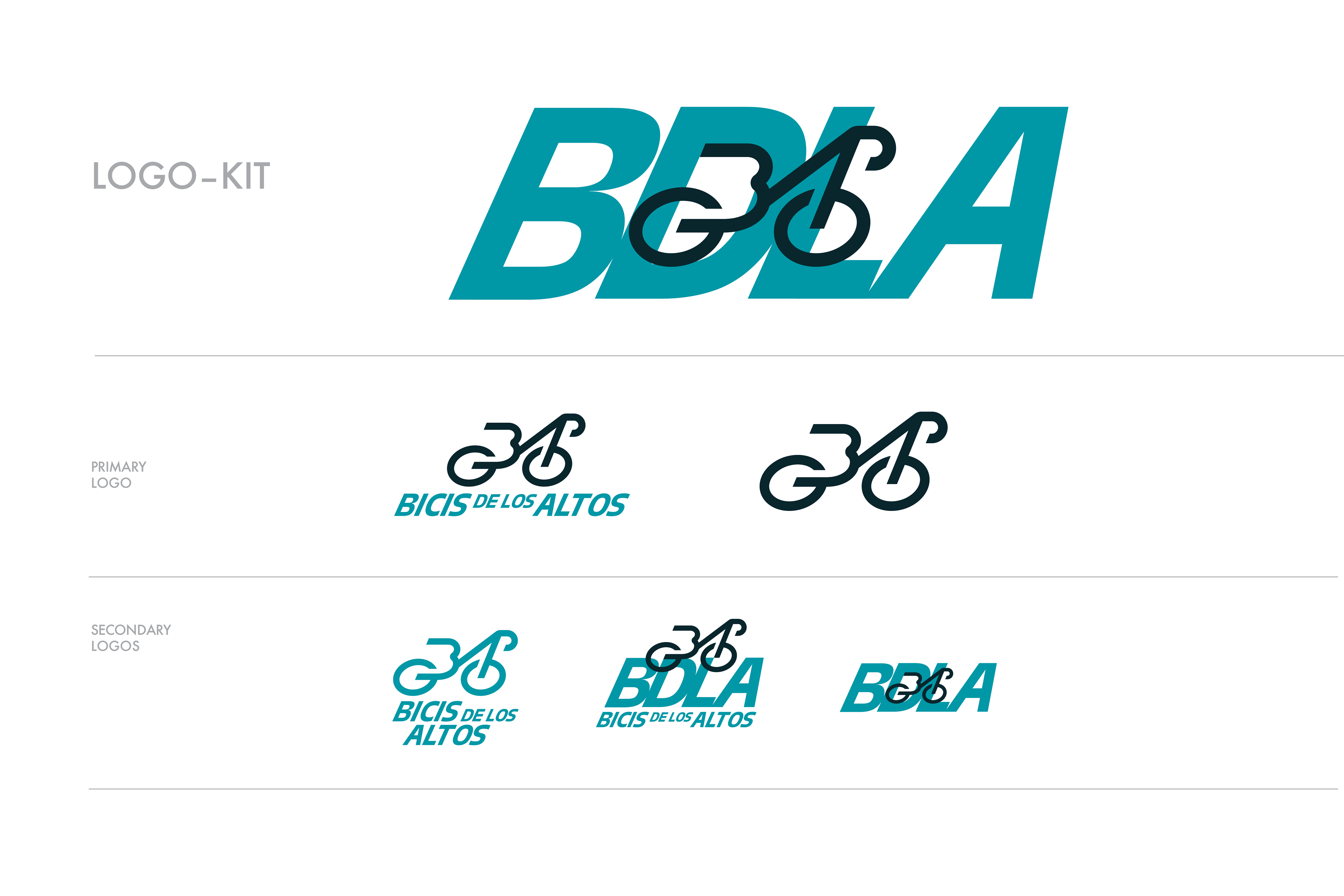
5. Logo-Kit Versatility
The brand system was designed with scalability and adaptability in mind:
The brand system was designed with scalability and adaptability in mind:
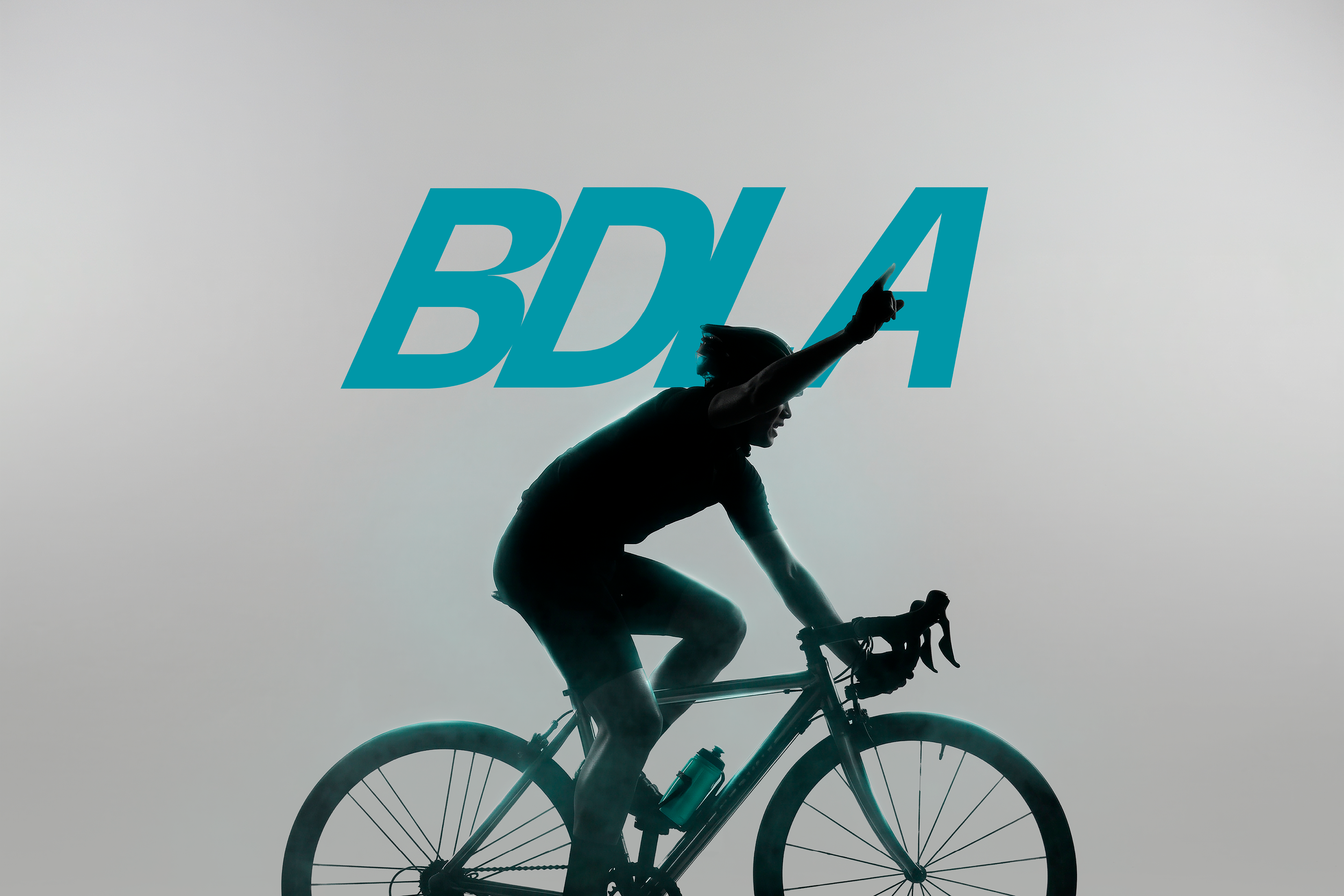
Primary Logo: A balanced composition for general use.
Monogram Version (BDLA): Ideal for social media, stamps, or components where space is limited.
Secondary Logos: Variations that allow the brand to be used on different backgrounds and formats without losing its visual identity, ensuring a consistent brand presence at all times.
Conclusion: This proposal is not just a logo, but a comprehensive visual system that communicates precision, speed, and belonging, elevating Bicis de los Altos to a professional-level brand.